


Aspect ratio is a fundamental concept in the world of images, videos, photography, and digital displays. Whether you’re a photographer, videographer, web designer, or simply interested in visual media, understanding aspect ratio is crucial for creating visually appealing, correctly framed content. This article unpacks what aspect ratio means, its applications in different media industries, how to calculate it, and its role in modern web design.
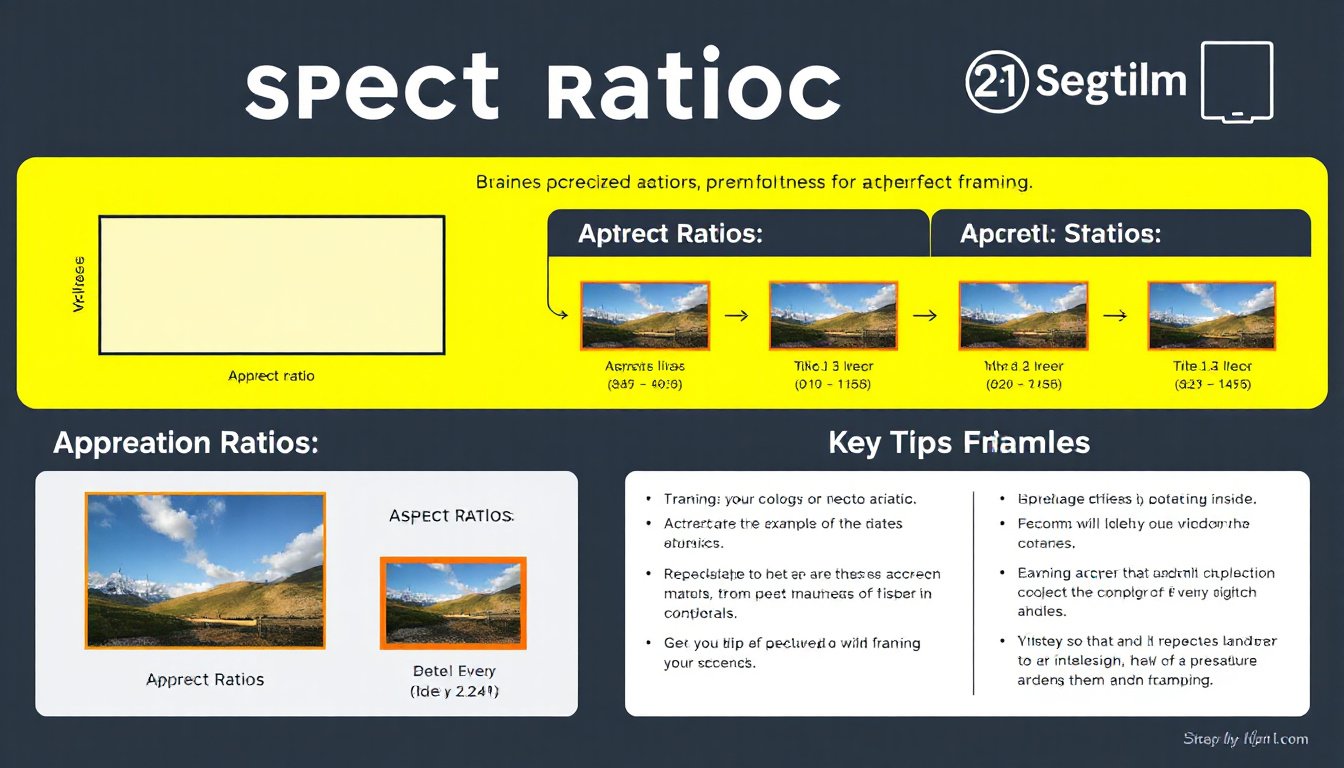
What is Aspect Ratio?
Aspect ratio is the relationship between the width and the height of an image or video. It is typically expressed as two numbers separated by a colon, such as 16:9, 4:3, or 1:1. The first number represents the width, and the second number represents the height. This ratio determines the shape of the rectangular frame in which your image or video is displayed.
Formula:
[
\text{Aspect Ratio} = \frac{\text{Width}}{\text{Height}} = W:H
]
For example, an image that is 1920 pixels wide and 1080 pixels tall has an aspect ratio of 16:9 because:
[
\frac{1920}{1080} = \frac{16}{9} \approx 1.78
]
Common Aspect Ratios in Use
Film and Cinematography
- 1.85:1 – Standard widescreen used in many modern films for a cinematic viewing experience.
- 2.39:1 (often rounded from 2.39) – Commonly used anamorphic widescreen format, producing ultra-wide images seen in epic films.
- 1.375:1 (The Academy Ratio) – Used in classic films and early cinema.
- Original formats like 4:3 (1.33:1), historically standard for older television and silent films.
Television and Video
- 4:3 (1.33:1) – The standard for traditional television screens and monitors until the rise of widescreen TVs.
- 16:9 (1.78:1) – The universal standard for high-definition TVs, computer monitors, and modern video content.
- 1:1 – Square format increasingly popular on social media platforms such as Instagram.
- 21:9 – Ultrawide format often found in gaming monitors and some cinematic presentations.
Photography
- 3:2 – Common in digital and film photography; this ratio reflects the 35mm camera sensor size.
- 4:3 – Dominant in many consumer and professional cameras.
- 5:4 and 1:1 – Used in medium format and artistic photography.
- 16:9 – Emerging in photography to match video and modern display standards.
Why Does Aspect Ratio Matter?
The aspect ratio affects the composition, framing, and presentation of visual content. When the wrong aspect ratio is chosen, images or videos may appear stretched, squished, or cropped, which can detract from their aesthetic or storytelling impact.
For instance:
- Showing a 4:3 image on a 16:9 screen without adjustment can introduce black bars (letterboxing or pillarboxing) or cropping.
- Cropping or stretching to fit a different frame might distort or cut important visual elements.
Since various platforms and devices require or favor specific ratios, understanding and controlling aspect ratio helps in preparing content that appears best formatted across devices and media.
How to Calculate Aspect Ratio
Calculating aspect ratio is straightforward if you know the width and height of your image or video. The ratio simplifies the width and height to their smallest whole numbers.
Example:
If an image is 1600 pixels wide and 1200 pixels high:
[
\frac{1600}{1200} = \frac{4}{3} = 4:3
]
Resizing While Maintaining Aspect Ratio
When resizing an image or video, it’s important to maintain the original aspect ratio to avoid distortion.
Formula to calculate a missing dimension:
[
\text{New Height} = \left(\frac{\text{Original Height}}{\text{Original Width}}\right) \times \text{New Width}
]
Or alternatively,
[
\text{New Width} = \left(\frac{\text{Original Width}}{\text{Original Height}}\right) \times \text{New Height}
]
Example:
You have an image 1600 x 1200 pixels, but you want it 400 pixels wide:
[
\text{New Height} = \frac{1200}{1600} \times 400 = 300 \text{ pixels}
]

Aspect Ratio in Web Design: The CSS aspect-ratio Property
In modern web design, controlling the shape of elements is essential for responsive layouts. The CSS aspect-ratio property allows developers to specify the width-to-height ratio of an element’s box, enabling consistent framing regardless of container or viewport resizing.
Key Points about CSS aspect-ratio:
- Syntax examples:
aspect-ratio: 16 / 9;oraspect-ratio: 1 / 1; - It maintains the aspect ratio when only one dimension (width or height) is set; the other adjusts accordingly.
- Supports replaced elements like
<img>, which will fallback to the image’s natural ratio once loaded. - If both width and height are explicitly set,
aspect-ratiohas no effect. - Supported widely across browsers since 2021, simplifying responsive media and layout control.
Example:
div {
  width: 300px;
  aspect-ratio: 16 / 9;
  background: lightgray;
}
This CSS ensures the div always maintains a 16:9 shape with a 300px width, adjusting its height automatically.
Practical Tips for Dealing with Aspect Ratios
- Cropping vs. Letterboxing: To fit an image into a frame with a different ratio, either crop the image (cut off parts) or add padding (letterboxing with black bars).
- Preserve Original Ratios in Video: Avoid stretching videos to new aspect ratios as it distorts the image.
- Use Responsive Techniques in Web: Use CSS properties like
aspect-ratioand media queries to adapt layouts fluidly. - Know Your Medium: Different platforms use different aspect ratios; for example, social media platforms often have preferred ratios for posts and ads.
Conclusion
Aspect ratio is an essential visual parameter that defines the width-to-height proportion of images, videos, and other rectangular media. Understanding it helps in producing well-composed, distortion-free visual content adaptable to various platforms and viewing experiences. Whether through manual calculations, utilizing aspect ratio calculators, or leveraging modern CSS tools, mastering aspect ratio ensures your content is perfectly framed every time.
By mastering aspect ratios, you unlock the ability to create stunning, appropriately formatted images and videos that look professional and polished across all devices and mediums.