


In today’s multi-device world, screen size compatibility is crucial for delivering a seamless user experience. From smartphones and tablets to laptops and TVs, devices come in varying sizes and pixel densities. This guide explores the essentials of screen size compatibility, the challenges it poses, and best practices to ensure your applications, designs, and digital content look great on any screen.
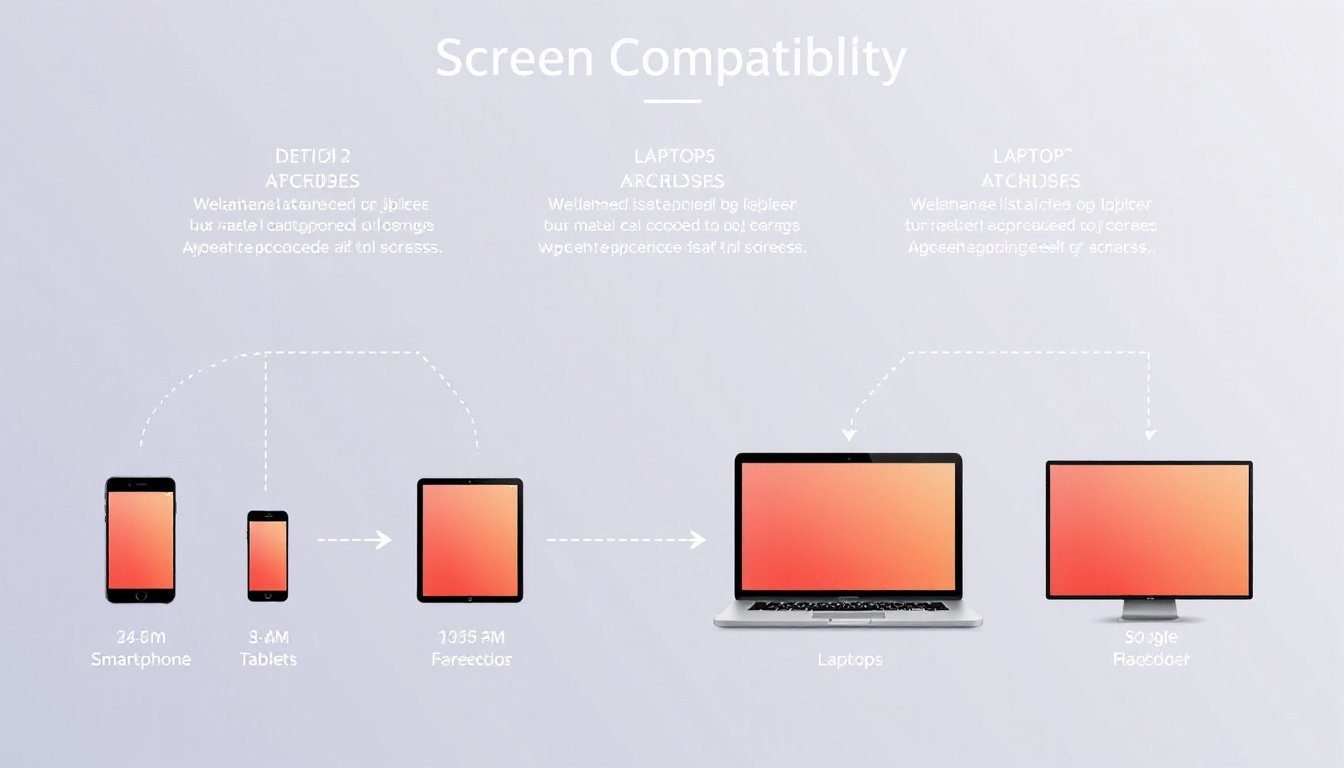
Understanding Screen Size Compatibility
Screen size compatibility refers to the ability of software and digital content to display correctly and optimally across different devices with varying screen dimensions, resolutions, and pixel densities. Without proper compatibility, users may encounter UI elements that appear distorted, improperly scaled, or hard to interact with, leading to a poor user experience.
Key Components of Screen Size Compatibility
- Screen Size: The physical or visible display area, often measured in inches diagonally or in pixels width × height.
- Resolution: The total number of pixels displayed on a screen, such as 1920×1080.
- Pixel Density: Usually expressed in DPI (dots per inch), it describes how densely pixels are packed on the screen. High pixel density means more pixels per inch, resulting in sharper images.
- Viewport Size: The area of the screen available for rendering content, especially relevant to web pages within a browser.
Why Screen Size Compatibility Matters
- Consistent User Experience: Different devices shouldn’t mean inconsistent UI experiences. Whether on a 5-inch phone or a 27-inch monitor, content should adjust seamlessly.
- Accessibility: Users with small or large displays, or varied screen orientations, should still have an enjoyable and effective interaction.
- Performance Optimization: Delivering only the necessary assets (like images optimized for a device’s pixel density) helps maintain fast loading times and battery efficiency.
- Brand and Professionalism: Well-adapted interfaces maintain the brand’s credibility and professionalism across platforms.
Challenges in Achieving Screen Size Compatibility
- Variety of Devices: As illustrated in device databases, physical screen sizes and resolutions can vary widely, e.g., from compact 11.6-inch Chromebooks with 1366×768 pixels to large 30-inch 4K UHD monitors with 3840×2160 pixels.
- Multiple Pixel Densities: Devices with similar screen sizes can differ in pixel density, requiring assets to scale without distortion.
- Orientation and Window Scaling: Users may switch between portrait and landscape modes, or use multi-window features, impacting layout.
- System UI Elements: Navigation bars, status bars, and other system decorations reduce visible screen space.
Best Practices for Ensuring Screen Size Compatibility
1. Design Flexible Layouts
- Avoid fixed sizes or positions for UI elements.
- Use relative positioning relative to parent or sibling elements.
- Allow components to stretch or shrink naturally to fill available space.
2. Implement Adaptive and Responsive Design
- Create alternative layouts tailored for different screen sizes or types.
- For example, an app layout optimized for phones can differ from one optimized for tablets or desktops.
- Use breakpoints to adjust the design based on screen width or resolution.
3. Use Density-Independent Units
- Measure UI elements using density-independent pixels (dp or dip) rather than physical pixels (px).
- This maintains consistent physical sizing across devices with different pixel densities.
4. Provide Multiple Density Assets
- Supply bitmap assets (images, icons) at multiple resolutions matching different screen densities (ldpi, mdpi, hdpi, xhdpi, xxhdpi, xxxhdpi in Android parlance).
- This avoids blurry or pixelated images caused by scaling lower-resolution assets on high-density screens.
5. Utilize Nine-Patch Bitmaps (for Android)
- For stretchable images such as buttons or backgrounds, use nine-patch bitmaps to designate stretchable zones.
- This prevents distortion when images are resized dynamically.
6. Test Across Real Devices and Emulators
- Use device emulators and physical devices covering a range of screen sizes.
- Employ tools like online screen size checkers and responsive testers for web content.
Tools and Resources for Screen Size Compatibility
Device Specification Databases
Understanding common screen sizes and pixel densities helps prepare designs and apps:

| Device Type | Typical Screen Size | Resolution (pixels) | Pixel Density (PPI) | Aspect Ratio |
|---|---|---|---|---|
| Smartphone | 5" to 7" | 1080×1920 | ~300-450 | 16:9, 19.5:9 |
| Tablets | 7" to 13" | 2048×1536 | ~264-330 | 4:3, 16:10 |
| Laptops | 11" to 17" | 1366×768 to 2560×1600 | ~100-220 | 16:9, 16:10 |
| Monitors/Displays | 21" to 30"+ | 1920×1080 to 3840×2160 | ~90-160 | 16:9, 16:10 |
Online Tools
- Screen Size Checker: Detects your current device’s screen resolution, viewport size, and pixel density to assist developers and designers.
- Responsive Testers: Simulate various screen sizes to preview how content adjusts.
- PPI Calculators: Convert between pixels, physical size, and density to plan assets effectively.
Conclusion
Screen size compatibility is a foundational aspect of modern app development, web design, and digital content creation. By understanding device diversity, leveraging adaptive design principles, and providing appropriately scaled assets, developers and designers can ensure software and media look sharp, function properly, and offer excellent usability across every screen size. Employing the right tools and adhering to best practices ultimately enhances user satisfaction and broadens your reach in a device-diverse world.
Keep in mind: Screen size compatibility evolves continually as new devices emerge. Regular testing and staying updated with platform guidelines (such as Android’s developer resources) are key to maintaining compatibility over time.