


Aspect ratio is a fundamental concept that describes the proportional relationship between the width and height of an image, video, or any visual element. Typically expressed as two numbers separated by a colon (for example, 16:9 or 4:3), aspect ratio significantly influences how visual content is experienced across various media, devices, and platforms. Whether in filmmaking, digital design, or responsive web development, understanding and applying the correct aspect ratio is crucial to maintaining the integrity, storytelling power, and user engagement of visual materials.

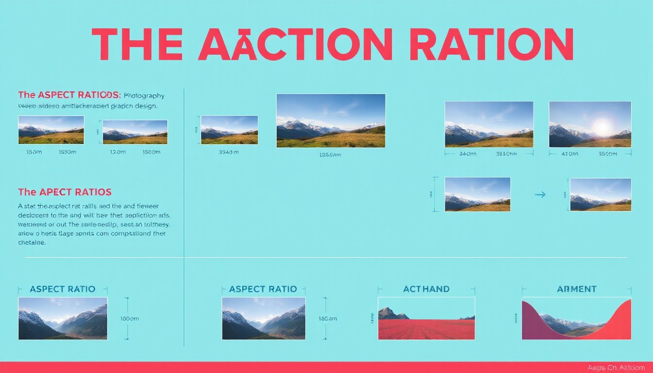
What is Aspect Ratio?
At its simplest, aspect ratio refers to the ratio between an image’s width and height. For example:
- A 16:9 ratio means the width is 16 units for every 9 units of height, common in modern widescreen TV formats.
- A 4:3 ratio, once standard in older TV and film, denotes a more square-shaped frame.
- Vertical formats, like 9:16, have become popular with mobile and social media content.
The aspect ratio determines not only the shape of the image but also how much of the scene or subject can be displayed. A wider frame captures more peripheral detail, while a taller frame may emphasize vertical elements such as a person’s full posture or tall architecture.
Why Aspect Ratio Matters in Filmmaking
Historically, aspect ratios in film were dictated by the technology of filmmaking and television. Early motion pictures used a 4:3 (1.33) ratio, evolving to the Academy Ratio (1.37) with the addition of audio tracks. As films pushed creative boundaries, widescreen formats such as Cinemascope (2.35) and Super Panavision (2.2) emerged, providing immersive, panoramic experiences ideal for epic storytelling.
Selecting the right aspect ratio in filmmaking is essential because:
- Storytelling and Emotion: Wider ratios (16:9, 2.35) are often used to emphasize grand environments or dramatic landscapes, immersing viewers in the cinematic world. Narrower or vertical frames might focus more on character expressions and intimacy.
- Viewer Experience: Human vision is naturally wider than it is tall, so widescreen formats feel more natural and engaging to watch.
- Technical Compatibility: Widescreen films viewed on standard TVs often require letterboxing (black bars) to preserve the director’s intended composition without cropping vital visual information.
In recent years, vertical video is gaining popularity due to smartphone usage and social media platforms like Instagram and TikTok. Filmmakers face opportunities and challenges in adapting storytelling to vertical frames that reflect everyday viewing habits while preserving cinematic integrity.
Importance of Aspect Ratio in Responsive Design and Media
In digital design, particularly responsive web and app design, aspect ratio governs how visual elements adapt to different screen sizes and orientations. Since users interact with content on devices ranging from small smartphones to wide desktop monitors, aspect ratio:
- Preserves Visual Integrity: Maintaining consistent aspect ratios prevents distortion, cropping, or stretching of images and videos, ensuring content appears professional and intentional.
- Enhances User Experience: Consistent visual proportions create a harmonious and predictable interface. Disruptions or inconsistencies can confuse users and detract from engagement.
- Supports Brand Identity: Utilizing a standardized aspect ratio across visual assets helps establish a cohesive look and memorable brand recognition.
- Improves Content Prioritization: Larger, wider aspect ratio images can draw attention to key messages or offers, while smaller or narrower ratios support secondary content—all facilitating efficient visual hierarchy and navigation.
Best practices for managing aspect ratio in responsive design include leveraging CSS properties like aspect-ratio and object-fit, using relative units (percentages, viewport units) for flexible scaling, and employing media queries to tailor visual elements based on device size and orientation.
Choosing the Right Aspect Ratio: Factors to Consider
Whether designing a film, a website, or a mobile app, choosing the appropriate aspect ratio depends on several factors:
- Content Type: Is the focus character-driven storytelling or scenic environment? Vertical ratios might suit personal vlogs or social media stories, whereas wide ratios better capture sprawling scenes.
- Viewing Platforms: Consider where your audience will primarily consume the content — social media, cinema screens, smartphones, or desktops — and select an aspect ratio optimized for that context.
- User Interaction: For interactive designs, maintaining aspect ratio consistency allows users to navigate seamlessly without distractions caused by distorted or awkwardly cropped visuals.
- Artistic Intent: Some creative projects employ multiple aspect ratios within the same piece (as seen in films like The Grand Budapest Hotel) to reflect changes in time, mood, or perspective.
Adapting and Changing Aspect Ratios
In media production and design, it is often necessary to adapt content to different aspect ratios post-creation. Tools like Adobe Premiere Pro enable users to adjust frame sizes, crop footage, or add letterboxing to preserve key visual information. In responsive web design, CSS techniques ensure images and videos adjust fluidly while retaining their original proportions.
However, these adaptations require careful planning. For scenes with significant horizontal or vertical movement, cropping or resizing can eliminate important details if not managed thoughtfully.
Conclusion
Aspect ratio is far more than a technical specification — it is a powerful storytelling and design tool that shapes how viewers perceive and engage with visual content. Whether crafting an emotional film, designing an intuitive website, or creating content for mobile applications, understanding the importance of aspect ratio enables creators to optimize aesthetics, preserve intentions, and enhance user experience across diverse platforms.
By thoughtfully selecting and managing aspect ratios, designers and filmmakers can ensure their work looks compelling and remains true to their creative vision, regardless of how and where it’s viewed.